How to Create an Eye-Catching Landing Page Design for your Online Course
What exactly is a landing page and how does it function?

As a facilitator, perhaps one of the most crucial steps in creating an online workshop at Klatch is to ensure that you have an effective landing page! Your course landing page is a web page where you can showcase your course and invite potential learners to sign up. In addition to being visually appealing, the landing page design should also include helpful information about the course, such as its duration and what topics are covered.
Essentially, you want to encourage learners to take action, such as signing up for a newsletter, subscribing to your blog, downloading an ebook that you may be selling, enrolling in your online course, or subscribing to a workshop series.
All page elements entice any visitor to become a loyal learner and customer!
You can add a variety of content to your course landing page, such as a description of your course, curriculum outline, and most importantly – a call to action button to allow students to enroll.
For more information, visit How to Generate Profitable Online Course Ideas for Your Online Workshop!
Creating a great headline

The headline for your page should be clear and concise, confirming your offer and reflecting the audience’s entrance point.
What not to do in your headline
The main goal of a headline is to grab the reader’s attention, however, there are other things to take into account:
- Limit bolded and repetitive text!
- Some critics say the use of bold and repetitive personalization in the piece makes it difficult to read.
- Do not use misleading titles.
- This type of marketer relies on often repeated claims to no avail. While your headline should capture the reader’s attention, it should be honest and never misleading. Always make sure that your title is catchy without being gimmicky or overbearing.
Recommendations
Earlier in this article, we discussed that one of a headline’s main goals is to stop the reader. Getting the reader to read the next sentence is the headline’s other key objective. Following that, they move on to the following sentence, and so forth.
Include images
Include a striking product image or photograph that relates to your message. According to specialists, our brains process visuals 60,000 times faster than text. So captivating images make your page look better and give your audience a better page experience. These visual cues also entice your audience to remain on your page to learn more about your offer.
Learn more about adding photos with The 10 Best Websites With Free Photos for Teaching Online!
Colors have meaning!
To project the characteristics you want to portray, choose colors that are associated with those qualities. For example:
- Red and yellow evoke energy and prosperity
- Blue produces intelligence while purple emphasizes trust
- Green would be great for workshop health and well-being
Highlight benefits
Why should visitors become part of your community? You want your landing page to clearly show how your workshop and online courses can benefit the learner. Use a bulleted list to explain how your offer directly solves their pain problems. Make sure to focus solely on the benefits of your product, not the features. You need to sell your audience first on why they need your product (aka how it solves their problem). Adding in all of the features at this point will only confuse or complicate their decision, leading to them not buying.

Your Call-to-Action
Your CTA button should stand out from everything else on the page. First, find the primary color of your site, then look at the color directly opposite it on the color wheel. That is the best complementary color for you to use for your CTA. For example, if your page background is blue, use an orange CTA to stand out from the rest of the site.
- Making sure the buttons are big enough for users to see and click quickly is one of the key things to account for when developing a website.
- Large buttons are key when designing a website, as they help users quickly find what they’re looking for and make selections.
- We have designed our website with a focus on simplicity and usability, making it easy for you to find what you’re looking for.
- Our website is designed to be simple and usable, so finding what you’re looking for is easy.
Include great course descriptions
An excellent course description can help convince students to join your online course, and it is important to ensure that the data is clear and straightforward to grasp. The last thing you want is to crowd your landing page with unnecessary information, but it is essential to include key points.
Let’s say that you are following a recipe, but it does not include any measurements; would you still buy it? On the other side, if it is very detailed, a novice chef can acquire a headache and give up midway through. When landing pages don’t have enough or too much information, learners often have questions that remain unanswered or may get overwhelmed. This could leave many of them feeling frustrated and unsure about whether or not to invest in the course. Include important details like course costs and benefits, but limit the amount of detail; perhaps stick to 2-3 core topics and save the rest for the workshop itself.

Tips on displaying pricing
Limited time pricing: If your product has a countdown or limited-enrollment period, clarify your pricing. This will help keep customers interested and motivated as they wait for the products to become available. Not doing so may result in lost sales because potential buyers won’t realize the benefits of purchasing now instead of later.
Special features: Consider including information on the unique characteristics of your product in your pricing details. In addition, you can include special offers, holiday deals, or first-time coupons!
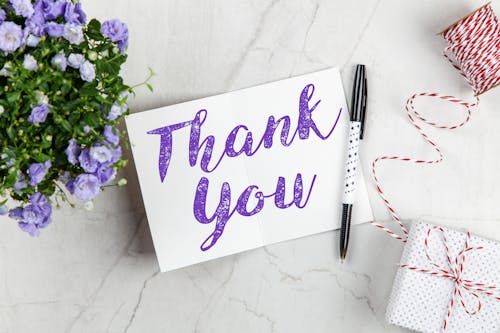
Add a Thank You!
You want to thank your existing learners and visitors for taking the time to check out your content! This fosters loyalty from your audience and encourages potential customers to become part of your learning community. Your thank you page could also be an excellent opportunity to introduce other products that may interest your audience. This might be another CTA asking them to share the content they signed up for, purchase your blog, sign on for your newsletter, attend a live training webinar or maybe give them a bonus piece of content to thank them for their loyalty. Finally, remember that your learners are the heart of your workshop and brand, and your landing page can be their first point of contact with you – their facilitator!
No monthly fees. Join hundreds of talented facilitators.
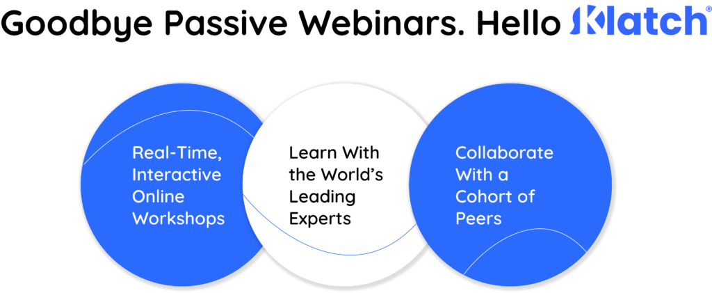
What is Klatch?
Klatch is a first-of-its-kind all-in-one social learning platform for live, hands-on, virtual workshops across every topic – from hobbies to professional development. Say goodbye to pre-recorded lectures and passive webinars; say hello to real-time, group-based learning. The Klatch platform enables experts to launch a workshop in minutes and provides the tools to unify their communities, grow their audience, and monetize their expertise. Apply to join the Klatch Facilitator community here or browse featured workshops here.